Dussur
Saudi Petrolite Chemicals, a joint venture between Dussur and Baker Hughes, required a unified brand identity to support the launch of its new chemical manufacturing operation in Saudi Arabia.
The identity needed to reflect the credibility and technical expertise of both parent organisations while establishing a distinct presence for the joint venture itself. At the same time, it needed to acknowledge Saudi Arabia's industrial ambitions and the broader transformation outlined in Vision 2030.
I led the project from concept through to delivery, working with a small team of designers to develop the identity direction and produce a comprehensive brand system. Alongside guiding the overall approach, I contributed extensively to the design work itself, shaping the visual language, brand applications and final guidelines.
The resulting system combines elements of the Baker Hughes and Dussur visual languages with references to Saudi heritage and industrial progress, creating an identity that feels both globally credible and locally grounded.
The Brief
The goal was to create a professional and authoritative identity for Saudi Petrolite Chemicals that could sit naturally alongside the reputations of its parent organisations while establishing a recognisable presence of its own.
The brand needed to:
- Reflect the joint venture between Baker Hughes and Dussur
- Convey technical expertise and industrial reliability
- Align with Saudi Arabia's Vision 2030 and expanding manufacturing sector
- Operate effectively across corporate, industrial and digital environments
- Provide a scalable system for long-term growth
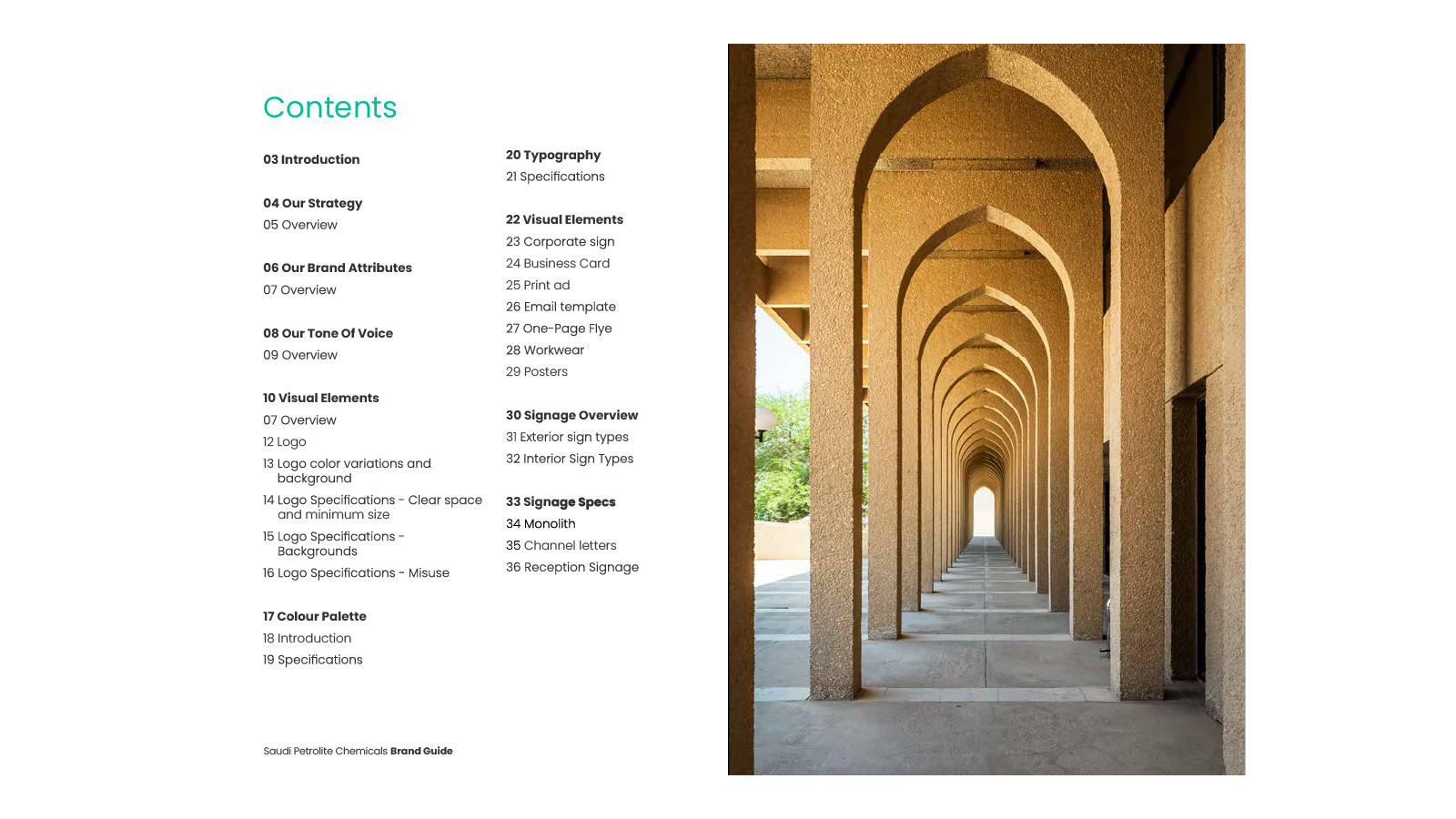
Beyond a logo, the project required a complete visual framework – one capable of supporting everything from corporate communications and technical documentation to on-site signage and operational environments.
Research & Discovery
The process began with exploring the visual ecosystems surrounding the new organisation.
This included reviewing the existing Baker Hughes and Dussur identities, analysing how their visual languages could inform the joint venture while ensuring the new brand maintained its own clarity and independence.
We also examined visual patterns across the global chemicals and energy sectors to understand how competitors communicate expertise, reliability and scale.
Alongside this industry research, we looked at visual cues rooted in Saudi culture and architecture – particularly geometric pattern systems and structural repetition – which could subtly inform the graphic language without becoming decorative.
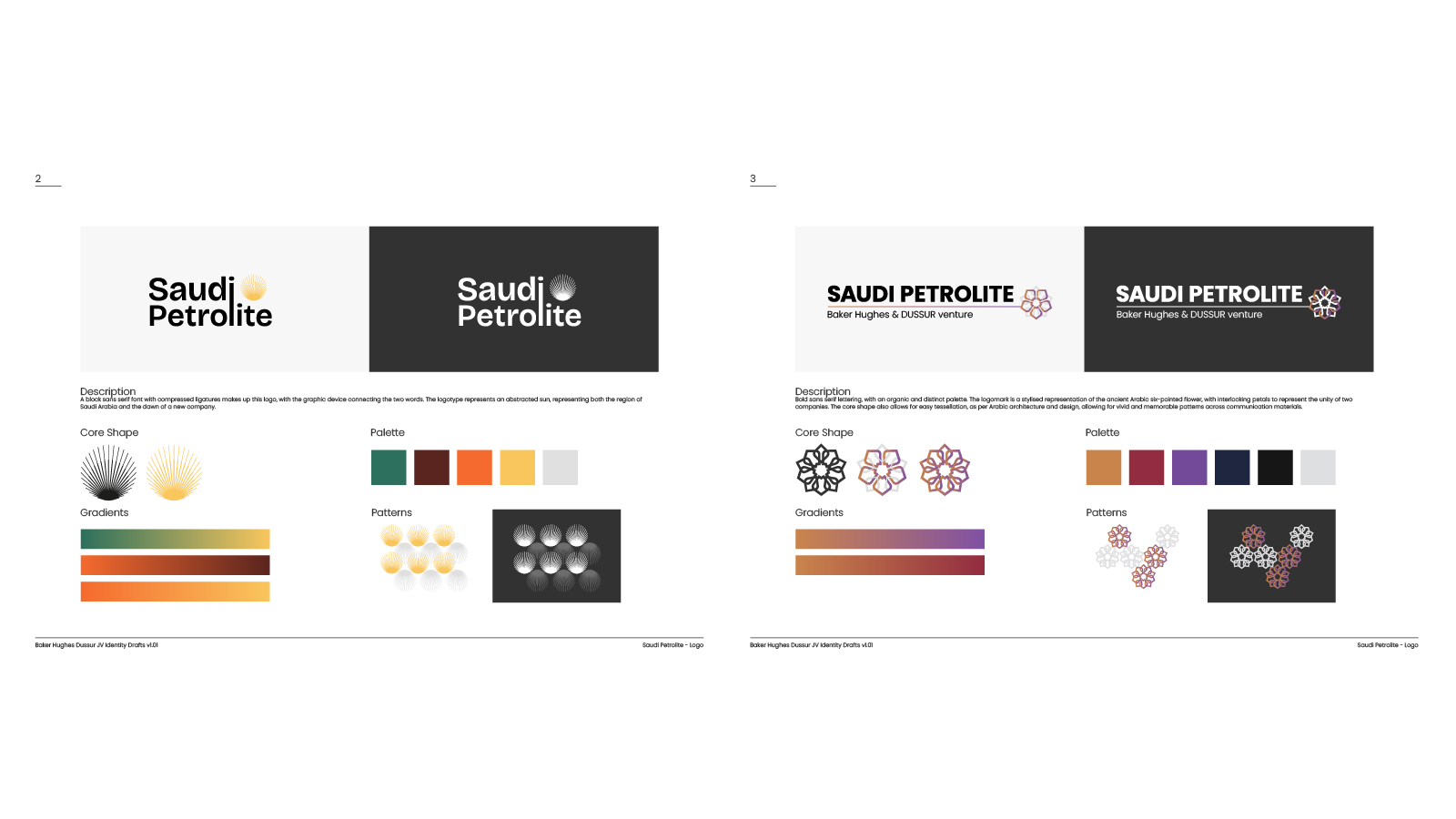
Early identity concepts explored a range of approaches, testing how these influences could be combined into a coherent and modern brand system.
Strategic Direction
The strategic direction focused on creating a brand that felt precise, modern and industrial, while reflecting the collaboration at the heart of the joint venture.
The system draws together several influences:
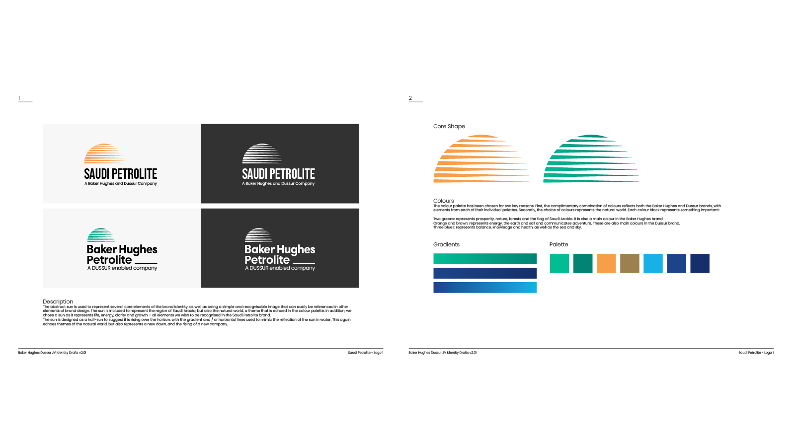
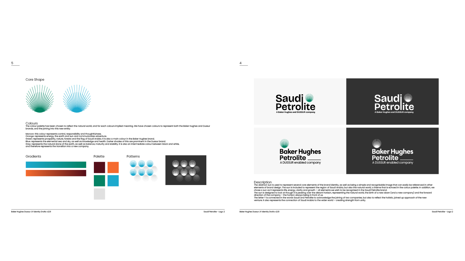
- Structural clarity inspired by engineering and chemical processes
- Graphic forms derived from molecular and structural patterns
- A colour palette informed by the Baker Hughes and Dussur brands
- Subtle geometric references inspired by regional architectural motifs
Together these elements create a visual language that reflects both global technical expertise and Saudi Arabia's forward-looking industrial ambitions under Vision 2030.
The brand guidelines were designed to clearly document this system, ensuring it could be implemented consistently across teams, suppliers and operational environments.
Design
The final identity system brings together logo, typography, colour and graphic patterns into a cohesive visual language.
Working closely with the design team, I refined the selected direction and developed the full set of brand assets, including:
- Primary and secondary logos
- Colour palette balancing Baker Hughes and Dussur brand influences
- Graphic patterns inspired by chemical structures and geometric repetition
- Typographic hierarchy and layout principles
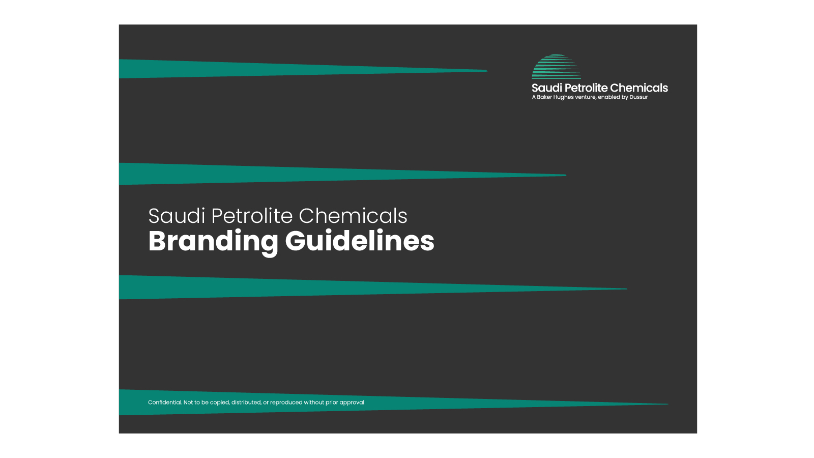
- A comprehensive set of brand guidelines
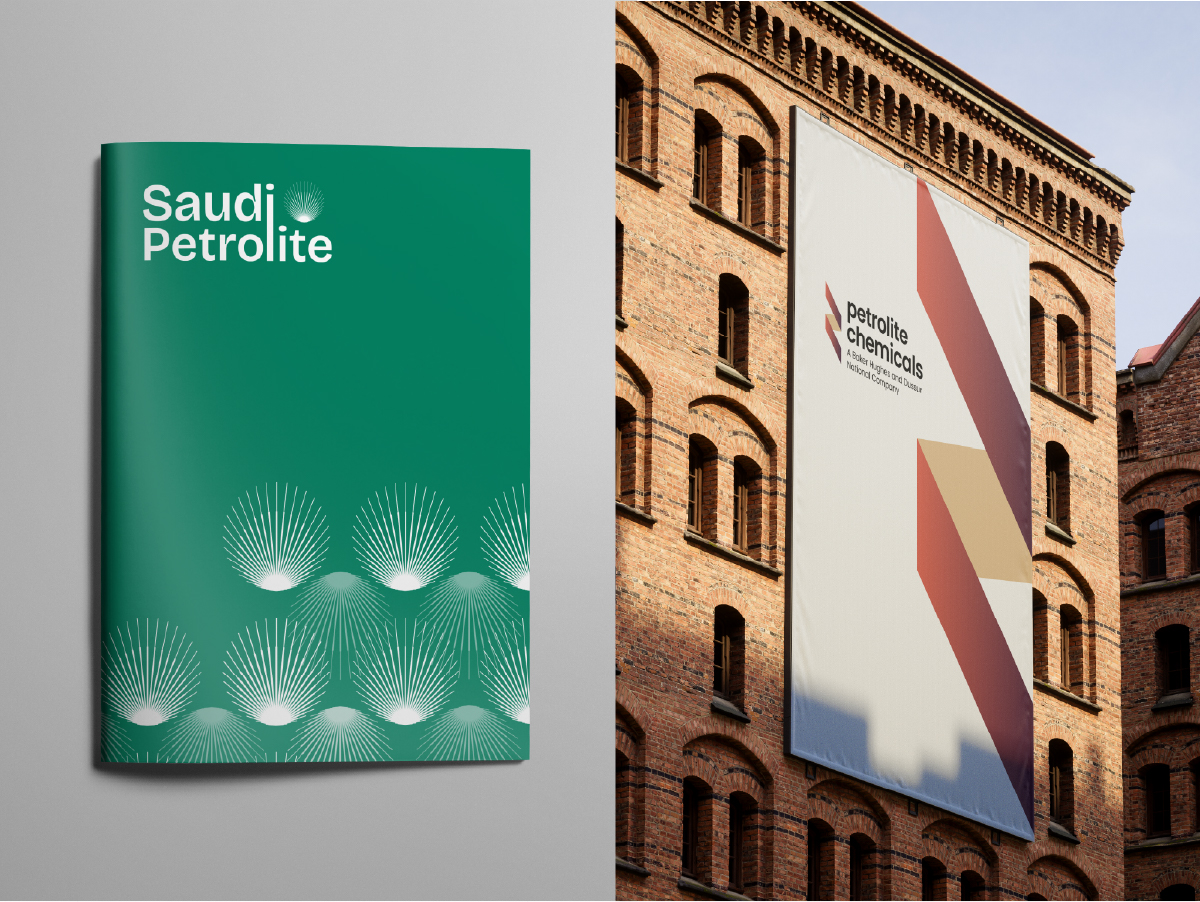
Each element was designed to operate as part of a structured system, allowing the identity to scale across corporate communications, operational environments and public-facing materials.
The result is a confident and contemporary identity that reflects both the company's technical foundation and its strategic role within Saudi Arabia's evolving industrial landscape.
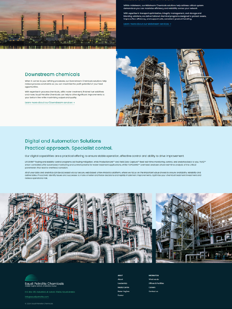
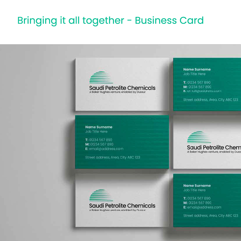
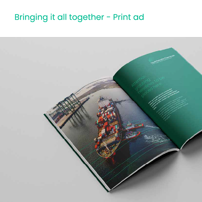
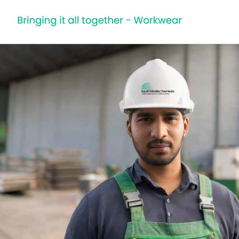
Application
The identity system was designed to function across a wide range of touchpoints.
Applications included:
- Corporate website and digital communications
- Business stationery and printed materials
- Print advertising and marketing collateral
- Branded workwear for operational environments
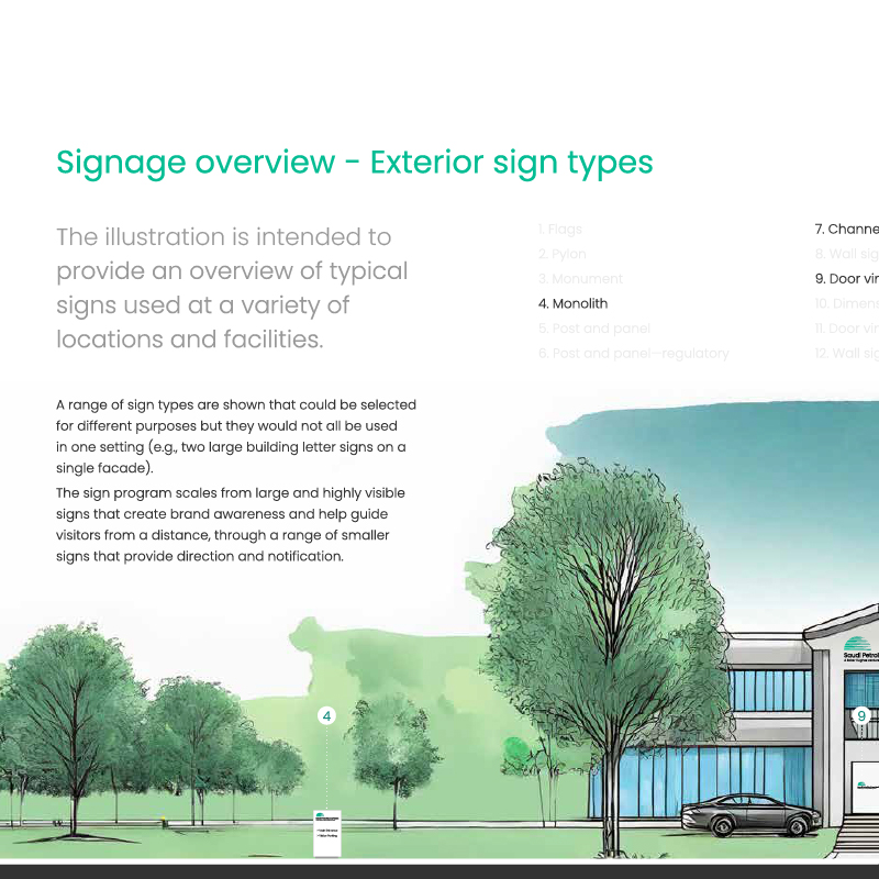
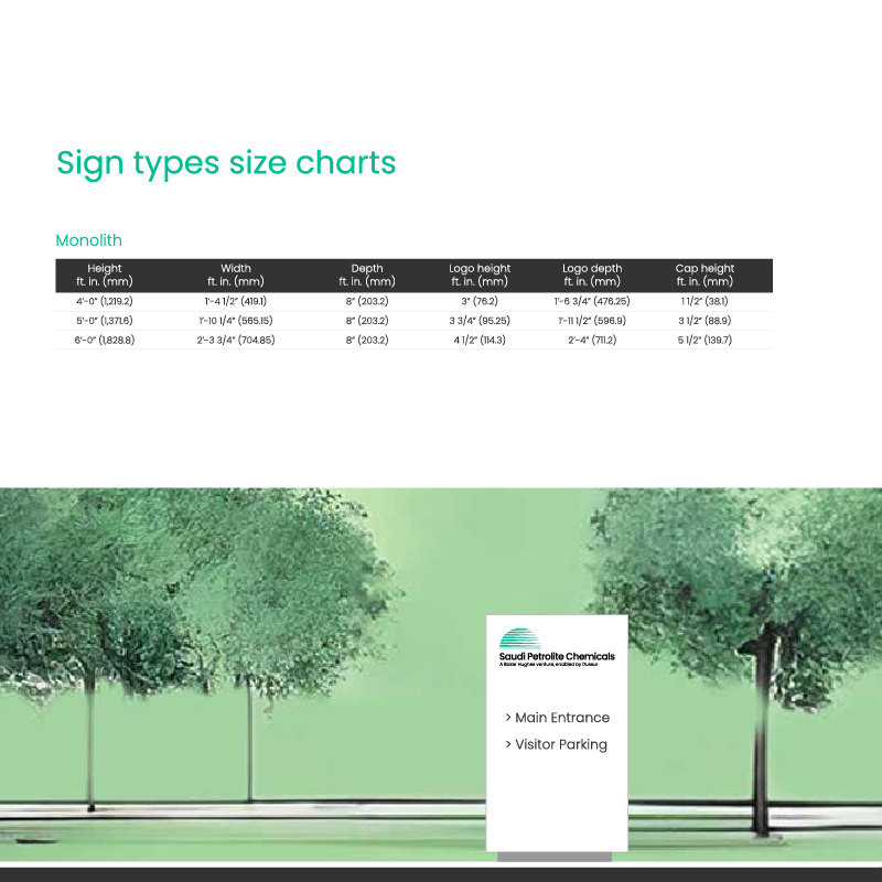
- Industrial signage and wayfinding systems
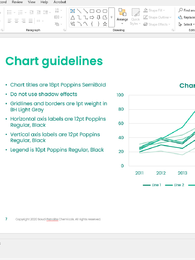
- Data visualisation and chart guidelines for technical reporting
Particular attention was given to the clarity and usability of charts and data graphics, ensuring that complex technical information could be communicated consistently within the brand system.
These applications demonstrate how the identity can operate effectively across both corporate and operational contexts while maintaining a clear and recognisable presence.

Outcome
The completed brand system provided Saudi Petrolite Chemicals with a strong identity for launch, establishing a professional and cohesive visual presence from day one.
The guidelines created a clear framework that can support the company's communications as it grows, ensuring consistency across marketing, operations and external partnerships.
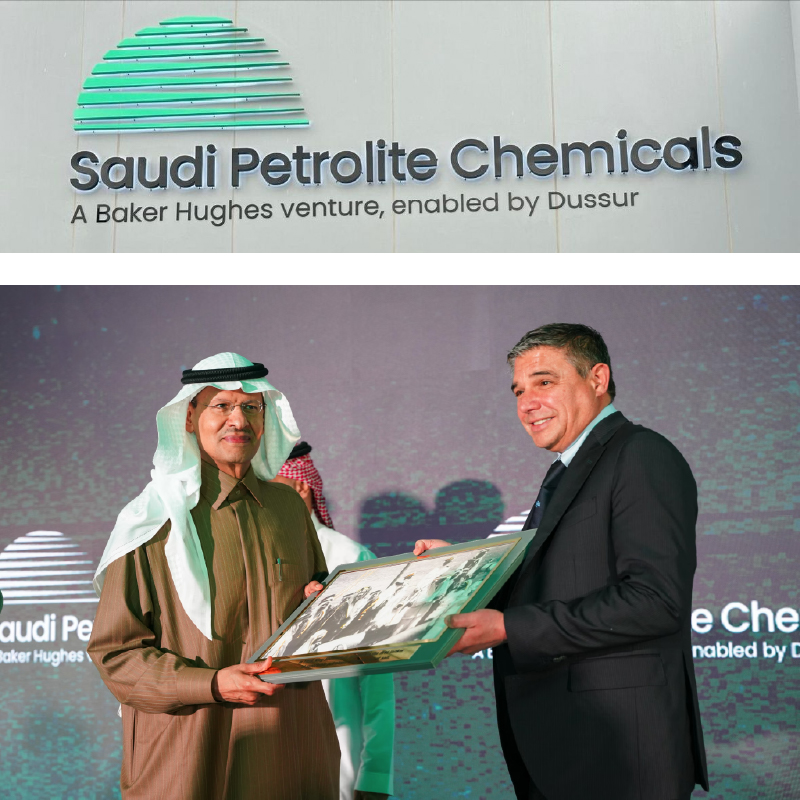
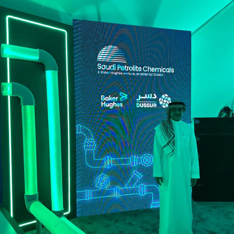
The identity was introduced through launch communications and exhibition environments, including a brand launch event and exhibition stand presence.
Together, these touchpoints helped establish the new organisation publicly while demonstrating the flexibility and clarity of the brand system.