Ocular

Ocular.graphics is a platform designed to help teams create consistent, on-brand content quickly and independently. By combining structured brand systems with intuitive tooling, it enables organisations to produce high-quality creative without relying on external production workflows.
As the platform evolved, it needed an identity that could reflect both its technical precision and its role as a creative enabler. The brand had to feel systematic and intelligent, while remaining flexible enough to live comfortably across product, marketing and digital environments.
I led the project from the ground up, designing the identity, product interface, iconography and website. Although developed internally, the project was approached with the same rigour as a client engagement – with defined stages, structured critique, and clear strategic intent.
The Brief
The goal was to create a brand and product experience that positioned Ocular as a credible and differentiated platform within a growing ecosystem of creative and brand tools.
The identity needed to:
- Communicate clarity, structure and control
- Reflect the platform's systematic, operational nature
- Scale seamlessly across product and marketing
- Provide a foundation for long-term growth
Beyond a visual identity, the project involved creating a complete and usable system – one that could function as both a brand and a working product environment.
Research & Discovery
The process began with a structured exploration of the product's purpose, audience and competitive landscape.
This included:
- Auditing comparable creative, automation and brand platforms
- Analysing visual patterns and positioning across the category
- Defining core product principles and behaviours
- Identifying how structure and flexibility coexist within the platform
A key realisation was that Ocular's strength wasn't expressive creativity alone, but its ability to bring order and clarity to complex brand environments.
This shifted the focus of the identity toward structure, framing and precision.
Strategic Direction
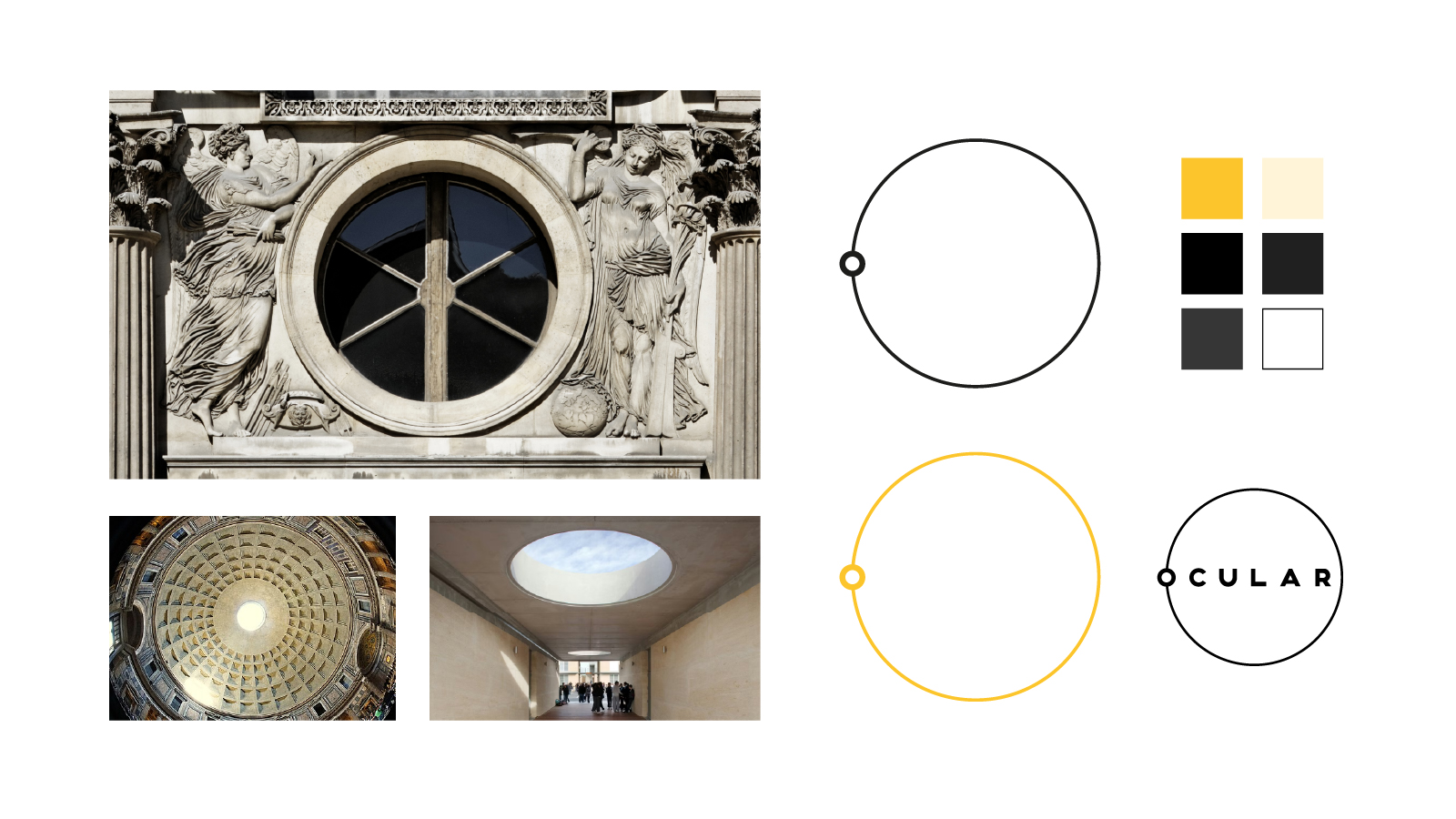
The concept centred around the idea of focus – both as a visual metaphor and a functional principle.
This informed a design system built on:
- Controlled geometry and framing
- Clear hierarchy and spatial logic
- Confident, minimal typography
- Graphic devices derived from cropping and perspective
The aim was to create a system that felt deliberate and precise, without becoming rigid or restrictive.
Design
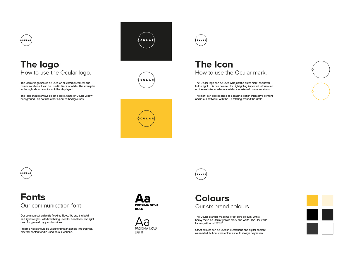
I developed the full identity and product design, including:
- Custom logotype and brand mark
- Complete visual identity and brand guidelines
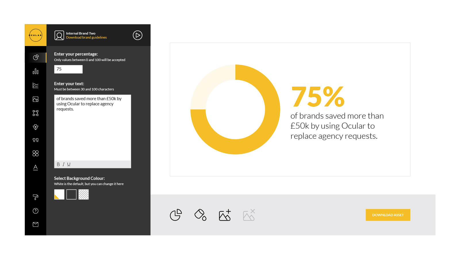
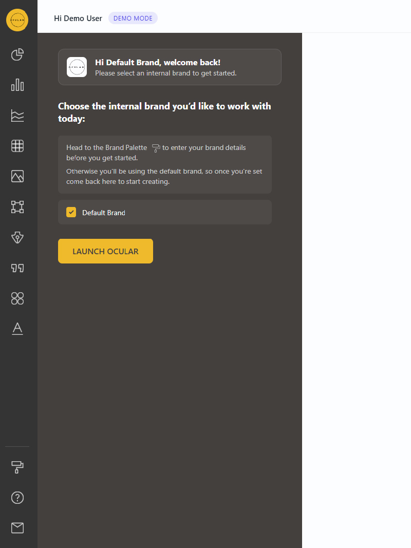
- Product UI and interface design
- Icon system
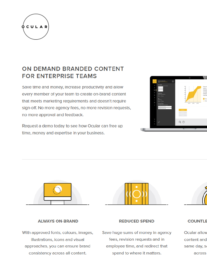
- Marketing website
The visual language balances neutrality with distinctiveness, allowing the product and content to take priority while maintaining a recognisable presence.
Every component was designed as part of a cohesive system, ensuring consistency across all applications.
Application
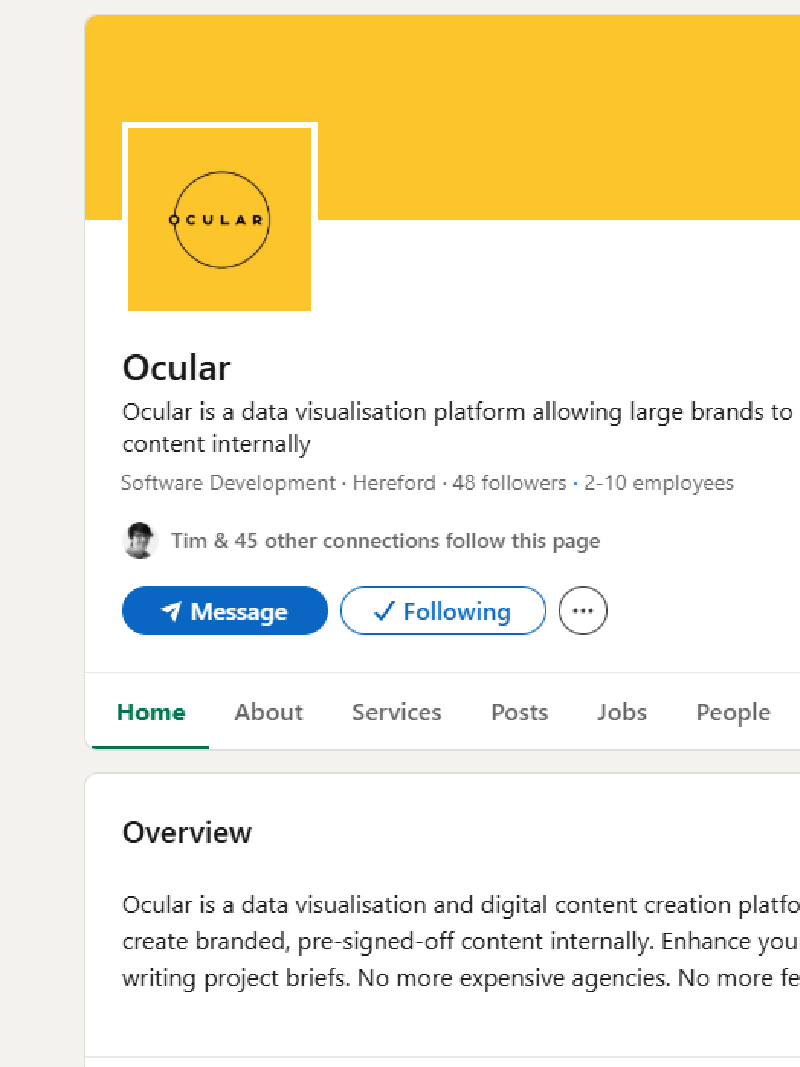
The identity was applied holistically across the entire platform and brand ecosystem, including:
- The core product interface
- Website and marketing presence
- Internal tools and documentation
- Communication and presentation materials
Because the product itself is an extension of the brand, particular care was taken to ensure the identity felt native to the interface, rather than layered on top of it.
The result is a seamless relationship between brand and product.
Outcome
The project established a clear and scalable foundation for Ocular.graphics, aligning its visual presence with its underlying philosophy.
The system provides:
- A cohesive and recognisable brand
- A fully integrated product experience
- A flexible framework for future growth
Most importantly, it created clarity – both visually and functionally – allowing the platform to communicate its value with confidence.
Reflection
Leading the project end-to-end reinforced the value of treating brand and product as a single, interconnected system.
Rather than existing as separate disciplines, each informed and strengthened the other.
This approach resulted in a brand that doesn't just represent the platform, but actively shapes how it works.